In this post we will discuss how to populate SharePoint 2013 Chart webpart from a SharePoint list. Though Microsoft removed chart web part, you can check this work around to make chart web part available in SharePoint 2013.
SharePoint list named "Course" which has 5 columns and the data are like below:
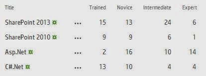
chart web part sharepoint2013
Here I want to show a chart (bar) and want to see in Sharepoint 2013 how many trained, novice, intermediate and expert people. Similarly for SharePoint 2010, Asp.net and C#.Net skills.
For this first add a chart web part to the page (Edit Page -> INSERT -> Web Part). Once you will put the chart it will appear like below. Save the page.

chart web part sharepoint2013
After that click on Data & Appearance. Then select Connect Chart To Data as shown in the fig below:

Connect chart to webpart sharepoint2013
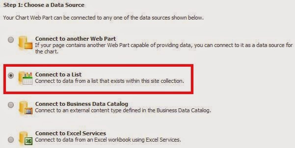
In the next step select "Connect to a List" in the Choose a Data Source section. Then click on Next.
connect list chart webpart sharepoint2013
In the next step select the site and the list in the drop down.
In the next step it will show you the list and the data. Click Next.
The 4th Step Bind Chart to Data is an important step. Follow below instruction. Here
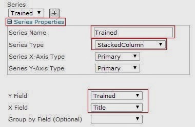
In the Series expand (click on +) Series Properties. Enter name, here I am putting based on my column names. It should be like below:
Series Name: Trained
Series Type: StackedColumn (From the drop down select the column).
Y Field: Trained (Select Trained Column from drop down)
X Field: Title (Remember this will be same for all series)
So it will appear like below:
series properties chart web part sharepoint2013
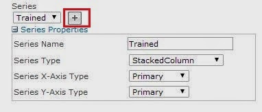
Then click on the + icon near series like below:
series properties add chart webpart sharepoint2013_6
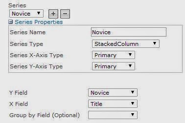
Here also fill the series details like below:
Series Name: Novice
Series Type: StackedColumn (From the drop down select the column).
Y Field: Novice (Select Novice Column from drop down)
X Field: Title (Remember this will be same for all series).
So it will be appear like below:
series properties chart webpart sharepoint2013_7
Add all based on the columns. Here I added 4 for each columns (Trained, Novice, Intermediate and Expert).
Then click on Finish.
Now your chat will appear like below:

chart web part sharepoint2013_8
If you want to customize a bit like you want to show the count as well as a image in the top right corner follow below steps.
Here click on Data & Appearance, then click on Customize your chat.
Here select Stacked Column and click Next as shown in the fig below:
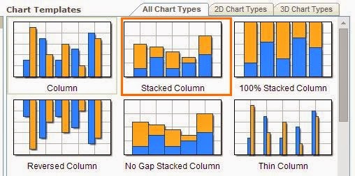
chart templates
You can set the width and Height of the chart web part. then click on Next.
The next step is very important, if you want to Show Legend then you chose Show Legend.

chart web part sharepoint2013_10
You can go to the Axis and Gridlines tab and if you do not want the Major Grid lines then you can deselect "Show Major Grid Lines" for both X and Y axis.
If you want to show the Labels then you can select the Label and click on Finish.

chart web part sharepoint2013_11
Finally your chart will appear like below:
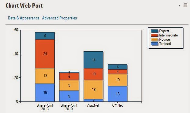
chart web part sharepoint2013_12
Share this:

Categories: Uncategorized
You must be logged in to post a comment.